Rebus Project- Initial Research

Scan 20

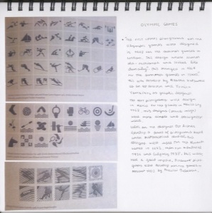
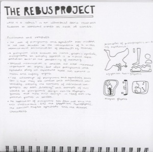
Pictograms have been used since the first civilisation, like the Egyptian hieroglyphics, the Mexican Mayas symbols and the Chinese characters, the use of pictograms ans symbols has increased in the last decades as a consequence of  technology. One example is the messenger symbol that is represented with the speech bubble, this symbol has became the international language for messenger. Pictograms were introduce in the Olympics games in 1948 making it easy for people with different nationalities to find a specific sport.

Scan 21

Life and Death Project – Final outcome

IMG_4866[1]-Recovered

After improving the concept by creating a more dramatic scenario, the idea of life and death is clearer than before. The death side shows a scenario of pollution and deforestation that leads to what we know as global warming. One of the consequences of global warming is climate change that has been affecting the earth quite heavily specially the last 10 years, causing for example melting ice caps.

In the other hand the concept of life is not dramatic as it shows a nice landscape. For this final outcome I created a series of patterns in Adobe Illustrator that help me create a precise lorry in paper.

Life and Death Project – Outcome

Scan 19Final outcome presented in the crit

Some of the feedback I got from my peers was that the concept of death represented by the Shell logo was not clear enough and that I could  draw a fine line that shows the outline of the lorry in the life side. instead of redesigning a new concept of death I am planning on creating a much more dramatic scenario that shows why fuels such as petrol can equal death. The new scenario will show the causes of the global warming, such as deforestation and pollution.

Life and Death Project – Ideas2

Scan 16This sketchbook page shows a different idea that consisted in representing death with something more strong visually. The idea consisted in using the word cow (with meat) for the right side of the lorry  and a cow for the left hand side of the lorry.After having a tutorial with Gabbi I realise that this idea was not meaningful enough.

Scan 18This idea consisted in representing a big scandal that took place in the UK last year. I kept in mind the previous concept and I thought that perhaps the idea could be improve by “telling” the story of big supermarkets selling horse meat as cow meat.

Scan 17Day Of the Dead. This concept is based around probably the most popular Mexican festivity. The idea is to represent death with the famous skull made by the printmaker Jose Guadalupe Posada known as Catrina. This concept shows death from a different point of view.Scan 15

My last idea and probably the most successful one as it shows a different type of lorry that typically transports liquids such as milk, water and petrol. I decided to use the concept of milk rather than water because is not very often we see lorries transporting water. The shell logo represents death from a point of view of pollution, green house effect and global warming.
Life and Death Project – Ideas1

Scan 12My first idea consisted in representing life and death from the point of view of ethic groups. I believe cultural differences enrich the world and instead of growing the cultural differences between ethnic groups are being less and less leading us to a world in which we are all the same. In the right hand side of the lorry I draw people that are all the same and in the left hand side of the lorry I draw people that represent different ethnic groups.

Scan 13 This idea is based around the biological term of life that says that something is consider to have life if is born if it grows, if it reproduces and it it finally dies. I wanted to represent this cycle in the lorry because it shows that life and death coexist.Scan 14

The anthropologist Wade Davis ask the question, “Do we want to live in a monochromatic world of monotony, or embrace a polychromatic world of diversity?”, in one of his ted talks. This idea relates with my first one but it is shown in a more simple way. Although I like the message behind the colours in the lorry I do not think people is going to understand it as they have not seen this ted talk.

Life and Death Project – Visual Mind Maps

Scan 11The visual mind maps exercise consisted in collecting a series of images from books, catalogues and magazines that represented in different ways the meaning of the words life and death.

I found this exercise quite useful as it show me a different way of generating ideas in a more creative way. For my next projects I will try to use this type of mind map as I think it could bring some interesting ideas that I might not have thought of if I made a normal brain storm.

My journey home mapping project – Final outcome

GD MY JOURNEY HOME MAPPING P1 A3-01

This is the final outcome for My Journey Home Mapping Project. I took the suggestions that were made at the crit session into consideration. Although I did not have to make many changes, the changes that  I made improved my work quite a lot. One example is the increase of the size of the whole composition, by making the composition bigger I improved use of the space and visibility of the text.

My Journey Home Mapping Project – Development

Scan 10

I decided to go back to my initial ideas and combine them as an info- graphic. Before presenting the final outcome I needed to make some changes like the intensity of the colour yellow and also align some of the text with the circles.Scan 9This is an sketch I made after researching the book called Diagrams- innovative solutions for graphic designers, this book gave me the idea of creating an “hand made” info-graphics as the subject of my this project is my personal journey home from university or vice versa.

Scan 8

After presenting my initial ideas, I get to the conclusion that visually the best ideas was the one with the images of google maps, but that perhaps that did not have the better content. I started playing with shapes to see if this could get me anywhere and eventually it gave me the idea that I could create and info-graphic. Something that I needed it to improve were the proportions as Gabbi mention in the tutorial.

My Journey home mapping project – Ideas

IDEAS

My first idea for this project consisted in measuring the time not by using words that are use to describe time such as hours, minutes, seconds etc but instead with songs.Scan 6

My second idea was to create a collage with images from google maps of my journey and combine them with the directions step by step of my journey.

Scan 7

The last idea is completely different from the first one, because I use time as is usually refer to; in minutes and hours. With this idea I wanted to invite people to think about their own journeys and the time they spend travelling by bus or car every day.